Foundation 提醒框
Foundation 可以很简单的创建一个提醒框:
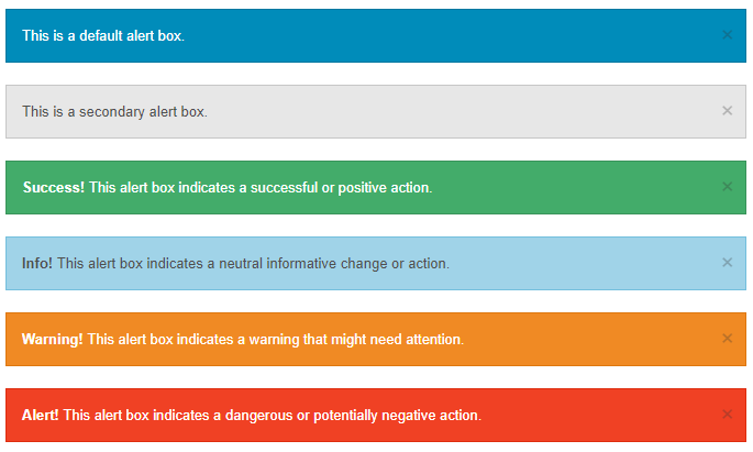
提醒框可以使用 .alert-box 类创建, 可以添加可选的类: .secondary, .success, .info, .warning 或 .alert:
<div data-alert class="alert-box">
  This is a default alert box.
</div>

<div data-alert class="alert-box secondary">
  This is a secondary alert box.
</div>

<div data-alert class="alert-box success">
  <strong>Success!</strong> This alert box indicates a successful or positive action.
</div>

<div data-alert class="alert-box info">
  <strong>Info!</strong> This alert box indicates a neutral informative change or action.
</div>

<div data-alert class="alert-box warning">
  <strong>Warning!</strong> This alert box indicates a warning that might need attention.
</div>

<div data-alert class="alert-box alert">
  <strong>Alert!</strong> This alert box indicates a dangerous or potentially negative action.
</div>
提醒框的宽度为容器的 100%。
圆角提醒框
.radius 和 .round 类用于为提醒框添加圆角:
<div data-alert class="alert-box success radius">
  <strong>Success!</strong> Alert box with a radius.
</div>

<div data-alert class="alert-box info round">
  <strong>Info!</strong> Alert box that is rounded.
</div>
关闭提醒框
要关闭提醒框,可以在连接或按钮元素上添加 class="close" 类,并初始化 Foundation JS:
<div data-alert class="alert-box">
This is a default alert box with closing functionality.
<a href="#" class="close">×</a>
</div>
<script>
// Initialize Foundation JS For Functionality
$(document).ready(function() {
$(document).foundation();
})
</script>